First impressions are vital. It is said that you have 7 seconds to grab a visitor's interest. They must know immediately what your website is about. This can be done with your choice of image(s), your logo, slogan, and content. But website design involves much more than first impressions.
It must be easy to navigate. It should not take more than two clicks to reach their information, and it should be easy to buy your products, fill out a form, "like" your website, or whatever it is that you want to achieve from your website. A "Call To Action" button should be clearly visible.
All elements on the page should be optimized for file size so that the pages load quickly.
Fonts and font sizes are important, and all websites should be accessible for the visually-impaired who may be using screen readers.
Our website design process takes into consideration your logo and any established colours that you already use, or we will design a new logo if you wish. Of course you will have total control over the appearance of the website. We will work with you until you are happy with it.
You will provide us with the content for the pages. We will edit it for grammar and spelling, AND we will ensure that you have the right keywords and meta descriptions so Search Engines will find you.
We will enhance, crop and size your photos for best effect.
All of our websites are built to be accessible for the visually-impaired.
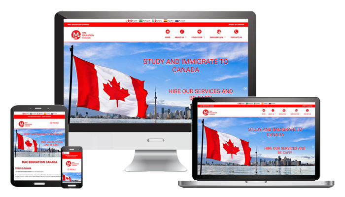
All of our websites are "Responsive", meaning that they are readable on any size device from a full size computer monitor, to a laptop, tablet or cell phone in both portrait and landscape mode.
 Proudly Canadian!
